Line charts and area charts are both used for presenting summaries. However, just because their purposes are interchangeable doesn’t mean they are interchangeable in every situation. Both types of charts, i.e., line and area charts, are used for presenting insights into trends or patterns that data presents.
However, if you don’t use the right type, drawing relevant insights from them becomes tougher, not necessarily impossible. Since dashboards are built with ease of understanding as one of the features, using the right chart becomes important. Line graph vs bar graph also plays a crucial role in data visualization, as both serve different purposes—line graphs are ideal for showing trends over time, while bar graphs are better for comparing discrete categories.
Here is a brief summary of area chart vs line graph and when to use them.
Table of Contents
- What is a Line Chart?
- What is An Area Chart?
- Line Chart vs Area Chart: Quick Comparison
- Choosing The Right Chart For Your Data
- What Type of Content Works the Best?
- Best Practices For Using These Charts
What is A Line Chart?
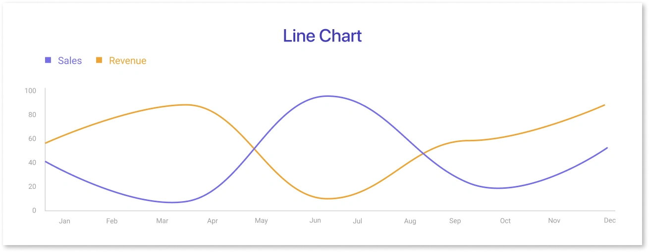
A line chart is a type of graph used to display information that changes over time. It represents data points, connected by straight lines, on a two-dimensional graph, typically with time on the horizontal axis and the variable of interest on the vertical axis. This type of chart is useful for identifying trends and patterns in data over a specified period.
It provides a progression of data over time. It tracks data for two metrics in a two-dimensional space. They are generally easy to read because they represent a straightforward trend within a data group. Line chart also offers a comparison between multiple individual data sets. However, line charts need continuous data points because the chart maps out a trend between two points, no matter how distant.
In short, a line chart shows how things have changed over time. A line chart, also called a line plot or data visualization line graph, shows changes in value by connecting points with lines from left to right. It shows the information on an XY grid by putting data points (called "markers") on the grid.
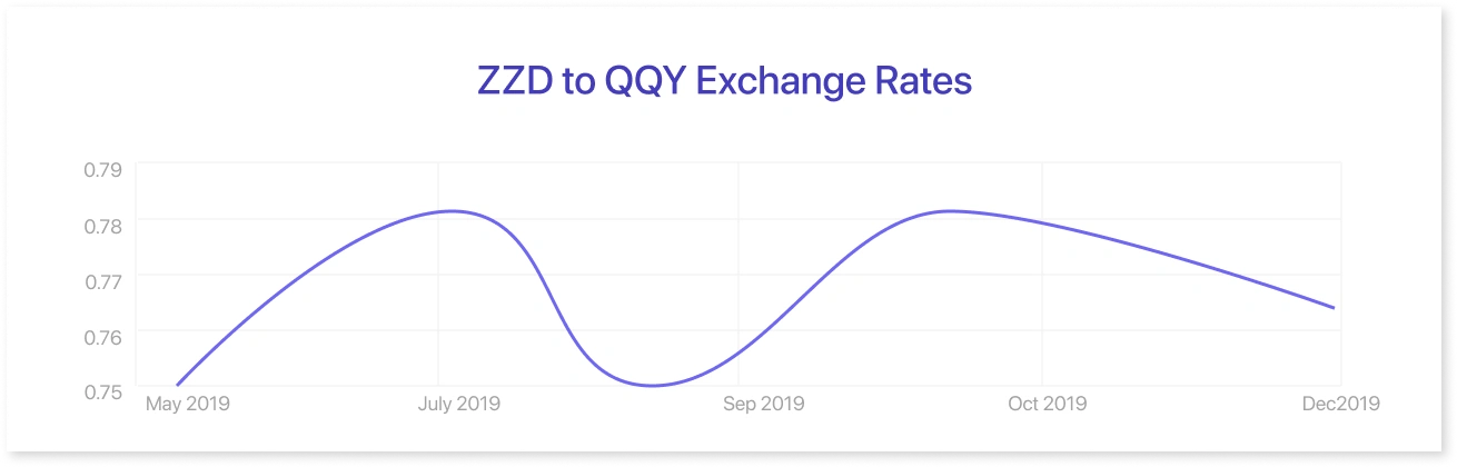
The line chart above shows how the value of two made-up currencies changed over the course of six months. As time moves from left to right, the daily exchange rates are linked by points. We can tell from the general slope of the line and its vertical points that the rate went from about 0.75 to 0.78 between March and early April, then slowly went down to about 0.765 in late May and June.
Advantages Of A Line Chart
Line charts offer several advantages that make them a valuable tool for data visualization. Firstly, they are excellent at illustrating trends and patterns over time. The continuous lines connecting data points provide a clear visual representation of the progression and direction of the data, making it easy for viewers to identify trends and changes. Secondly, line charts enable effective comparisons between different categories or series.
By plotting multiple lines on the same chart, which is also called a multi-line chart, they allow for quick and accurate comparisons of data sets, highlighting differences and similarities between variables. This feature is particularly useful when analyzing data with multiple variables or comparing groups. Additionally, line charts are simple and easy to interpret, making them accessible to various audiences. Their straightforward design and intuitive nature facilitate quick comprehension of the presented data, promoting effective information communication.
What is An Area Chart?
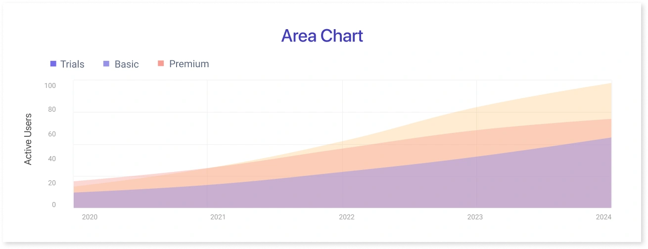
A line graph shows how data changes over time, and so does an area chart, also called an area graph. It uses the line chart to show how the numbers in one or more groups change as a second variable. An area chart differs from a line chart because, like a bar chart, it has shading between the lines and a border. On an XY grid, data points are recorded and then linked together to make a line. Then, colors or images are used to fill in the space between the drawn line and the x-axis.
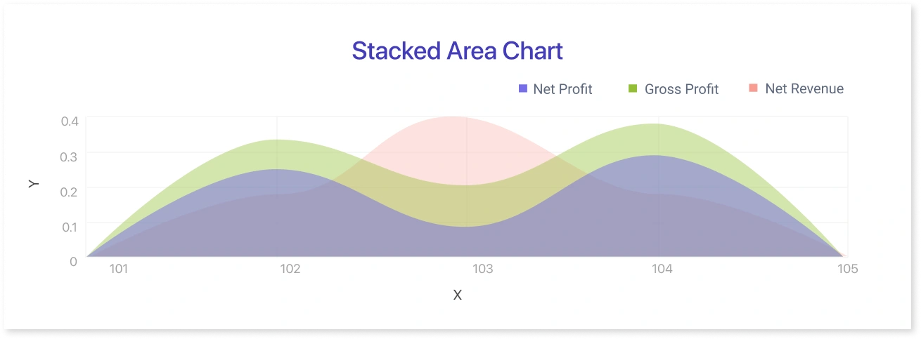
In this graph, the x-axis represents the months of the year, and the y-axis represents the total sales. A different color represents each product (A, B, and C), and the stacked areas show the contribution of each product to the total sales for each month. The height of the areas represents the total sales, and the stacked areas help visualize how the sales of each product contribute to the overall trend.
Advantages Of Area Chart
There are various advantages to using area charts that make them a valuable tool for data visualization. Firstly, they excel at illustrating trends over time. With the filled areas between the lines, they provide a clear visual representation of the changing magnitude of data points, allowing viewers to identify patterns and fluctuations easily. Secondly, area charts enable effective comparisons between multiple categories or series. By stacking the areas on top of each other, also known as the stacked area chart, they showcase the relative proportions and contributions of different elements within the dataset. This feature is especially helpful when analyzing data with multiple variables or comparing different groups. Lastly, area charts are visually appealing and can engage audiences by presenting data in a visually pleasing and intuitive manner. Their smooth curves and shaded areas make them visually stimulating, enhancing the overall impact of the data presented.
Line Chart vs Area Chart: Quick Comparison
Feature |
Line Chart |
Area Chart |
|
Focus |
Trends, precise data changes |
Volume, cumulative totals |
|
Y-Axis Requirement |
Not required to start at zero |
Should start at zero to avoid misleading visuals |
|
Best Use Case |
Multiple data series comparison |
Showing parts-to-whole or emphasizing totals |
|
Risks |
Can get cluttered with many series |
Occlusion or misleading visuals if not zero-based |
|
Ideal For |
Clarity in trends |
Highlighting magnitude or compositional data |
Choosing The Right Chart For Your Data
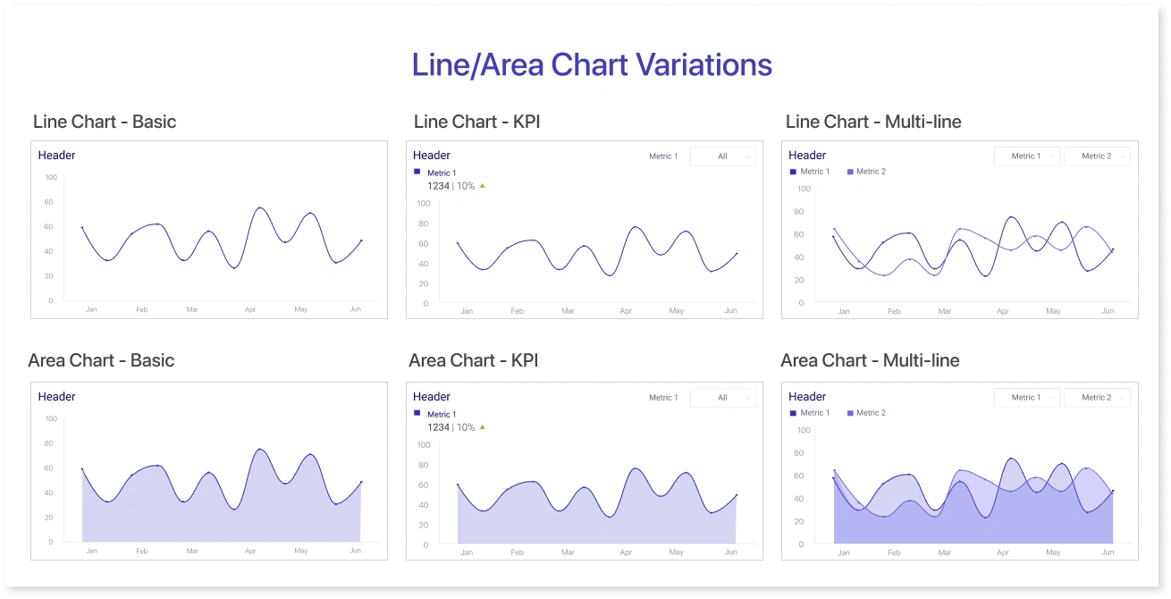
The availability of different variants of line and area charts in Mokkup.ai templates and wireframes offers valuable benefits for data professionals. These variants provide a range of visualization options to communicate data insights effectively. The basic line chart variant enables the clear representation of trends over time or categories. Multiple line charts assist in comparing multiple datasets, allowing for easy identification of patterns and relationships. Stacked area charts are useful for showcasing cumulative totals and the relative proportions of different categories. In dashboard wireframing, selecting the right visualization—whether bar charts vs line charts, funnel charts, sunburst charts, or bubble charts—is crucial for ensuring clarity and usability. By utilizing these variants, users can create engaging and informative mock dashboard wireframes that enhance data communication and decision-making processes.
Now let’s discuss briefly, ideally, when you should use these charts
A. Line Charts
- When there is a definite progression in data over time
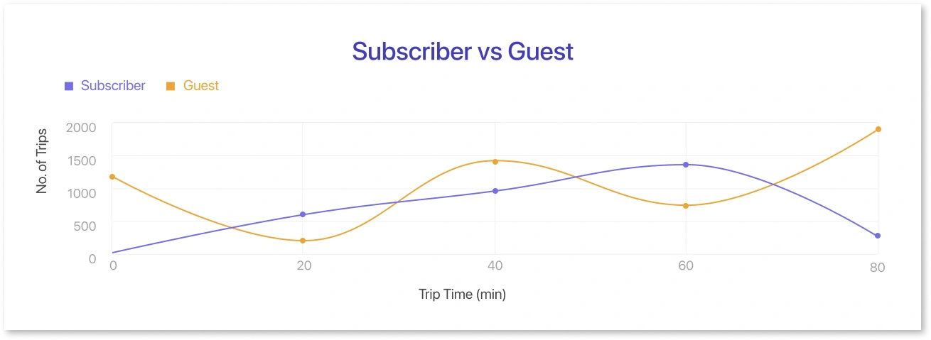
- When there are multiple data sets. Since line charts are just lines joining points of data, any number of datasets can be represented on the chart. This is ideal for highlighting how multiple data sets have progressed over the same time period.
- When the analysis only requires short-term to medium-term data. While line charts are still useful for long-term data analysis since the data points over long and super-long terms either normalize or exhibit wide variations, the corresponding values for the time period in between two values become difficult to highlight. In the example given below, when tracking data from 2011-2021, the percentage change for June 2021 becomes difficult and less accurate to rely on for decision-making.
- When all the data sets are close enough, if two data sets are vastly different, for example, one data set tracks the changes with the lowest being 5% and the highest being 30%, while the other data set tracks changes where the lowest is 20%, and the highest is 200%, then it will be difficult to draw any meaningful conclusions from the graph because the second one dwarfs the first graph. That would not yield reasonable results or good analyses.
- When the data sets correspond to roughly similar periods, the below example applies to time periods as well. If one data set tracks from 2020-2030, while the other tracks from 2015-2020 and from 2045-2050, the graph must be stretched to accommodate the second data set. As a result, there will be no intersection/overlap of the graphs as the x-axis periods are varied. The first graph would show zeroes for the years 2015-2020 & 2045-2060
B. Area Charts
- If the differences between your data values are big enough to be shown clearly, it may be easier for your audience to see and understand the data using a colorful area chart template instead of a line chart. An area chart data visualization is usually made up of more than one line to compare groups (also called a series) or show how a whole is broken down into its parts. This makes two types of area charts, one for each use case.
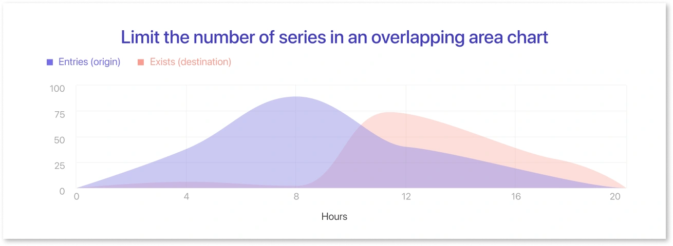
- When we want to compare the numbers of different groups, we get an area chart with overlapping areas. Start with a normal line chart to make an overlapping area chart. For each group, one point is put at each horizontal value, and the height of the point shows the group's value on the vertical axis variable. A line goes from left to right through all of a group's points. The area chart has a zero background and shading between each line. Since the shade for groups usually overlaps to some degree, some transparency is added to the shading so that the lines of all groups can be seen easily. Based on which group's clear color can be seen, the shading helps to show which group has the most value.
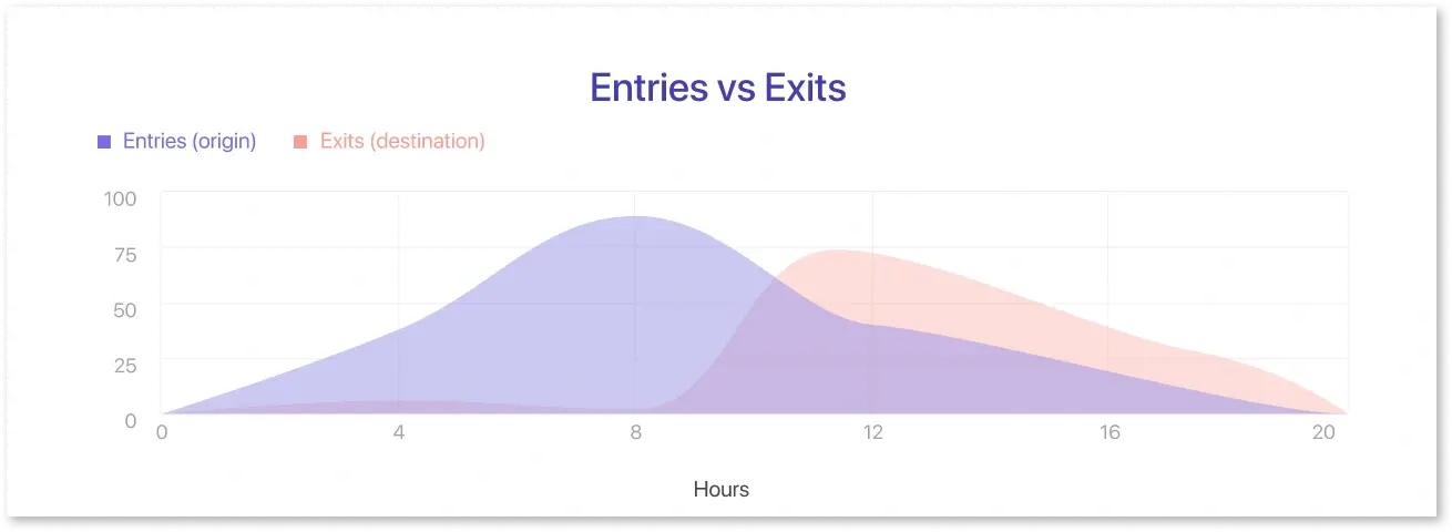
- Most of the time, when the word "area chart" is used, the stacked area chart is what is meant. In the shared area chart, each line was colored from its vertical value to a common baseline. In a stacked area chart, lines are drawn one at a time, with the height of the most recently drawn group acting as a moving baseline. So, when you add up all the groups, the total will be the height of the top line when it is fully stacked.
What Type of Content Works the Best?
A. Line Charts
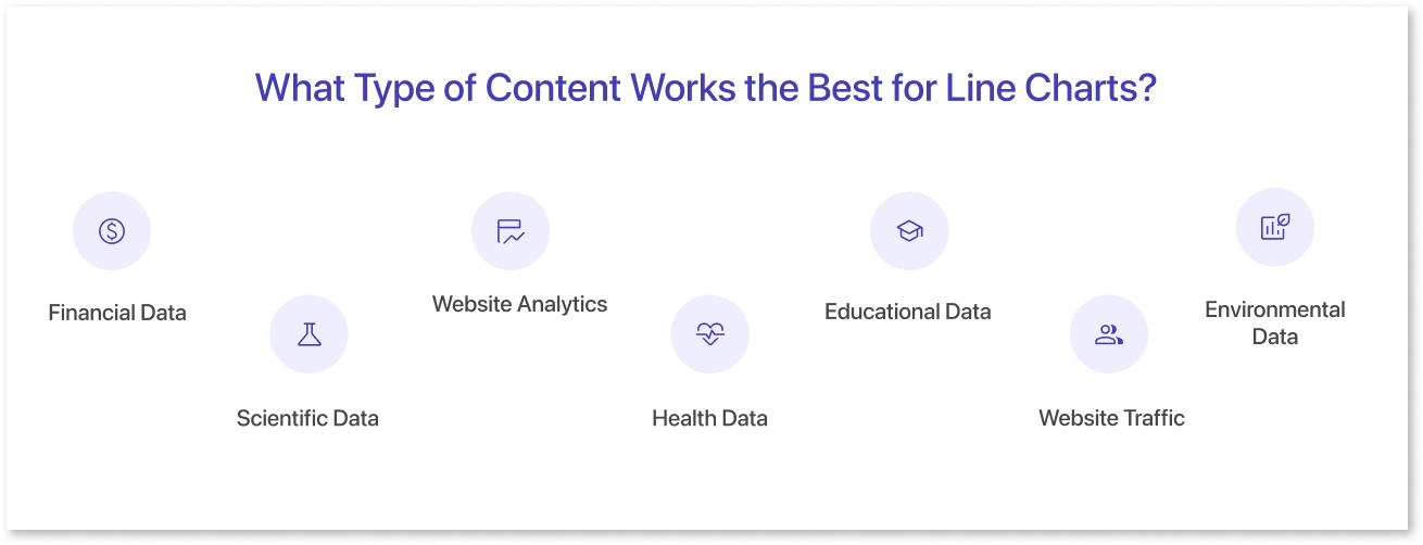
Line charts are versatile and can work with various types of content, especially where tracking changes over time or showing trends is critical. Here are some examples of the type of content that work well with line charts:
- Financial Data: Line charts often display stock prices over time, economic indicators like GDP or unemployment rates, company revenue or profit trends, and other financial data.
- Scientific Data: In science, line charts can be used to track changes in temperature, pressure, or other variables over time during an experiment.
- Website Analytics: Line charts can display website data, like page views, unique visitors, or bounce rate, over a specific period.
- Health Data: In health and medicine, line charts can show patient vital signs over time, the progress of an epidemic, changes in weight loss or gain, and much more.
- Education Data: You could use line charts to track students' test scores over a school year or to compare the performance of different schools or educational programs over time.
- Website Traffic: A line chart can showcase website traffic by representing the number of visitors on the y-axis and the corresponding periods on the x-axis. The line connects the data points, revealing the overall trend of website traffic over time, allowing for analysis of peak periods, seasonal patterns, and changes in user engagement.
- Environmental Data: Line charts can be used to track changes in weather patterns, pollution levels, population sizes, and other environmental data over time.
B. Area Charts
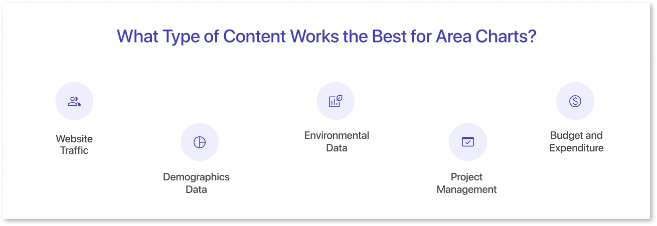
An area chart is similar to a line chart, but the area under the line is filled in, giving a sense of volume. This type of chart is typically used to represent cumulated totals over time or to show the distribution of data points among different categories. Here are examples of the type of content that can work well with area charts:
- Website Traffic: An area chart could show the number of visitors to a website over time. Different colors or layers could represent different traffic sources, such as direct visitors, referrals, social media, and search engines.
- Demographics Data: You could use an area chart to visualize changes in the population of a country, state, or city over time, with different colors or layers representing different age groups, genders, or other demographic groups.
- Environmental Data: Area charts can illustrate changes in rainfall, temperature, or other environmental factors over time.
- Project Management: Area charts can be used in project management to represent completed tasks versus total tasks over time, providing a sense of progress and how much work remains.
- Budget and Expenditure: An area chart could illustrate the allocation of a budget across different departments or projects over time.
Best Practices For Using These Charts
A. Line Charts
1. Choose an appropriate measurement interval
Choosing the right interval size or "bin size" is an important part of making a line chart. If the measurement period for temporal data is too wide, it may take too long to see where the data trend is going, hiding the useful signal. On the other hand, if the measurement time is too short, it may only show noise and not the signal.
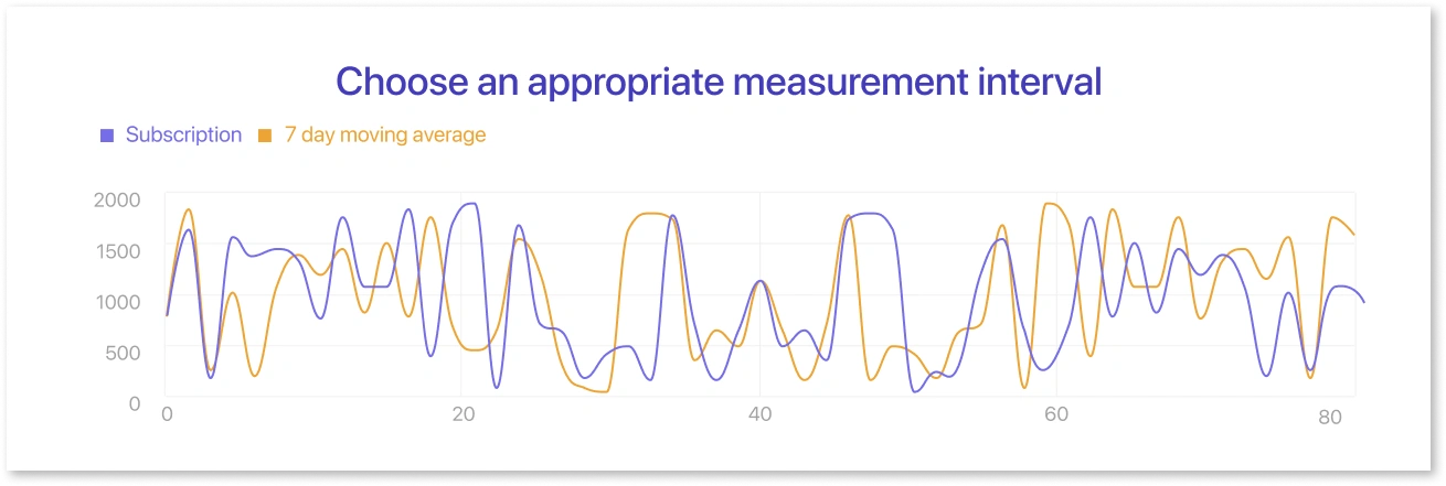
A good choice of bin size can be found by trying out different intervals or depending on what you know about the data being recorded. It is also possible to use more than one line, with one line showing a small interval and the other showing the general trend by averaging over a rolling window.
2. Don’t plot too many lines
With great power comes great duty, so even though it is technically possible to put a lot of lines on a single-line chart, you should be careful about how much data you plot. A good rule of thumb is to stick to five lines or less so the story doesn't get so complicated that it's hard to follow. You can still plot all of the numbers you want to track, though, if the lines are far enough apart.
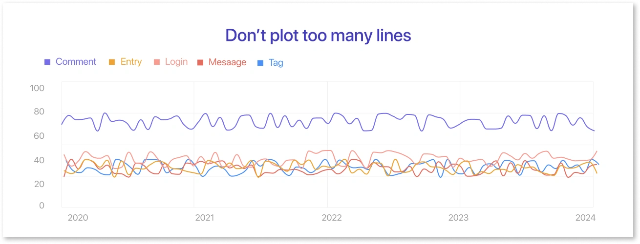
If you need to draw more lines than can fit on a single axis, you might face the plots into a grid of smaller line charts. It will be harder to see details in these plots, so it's a good idea to sort them by something important (like average or end value) to help bring out important points. If you're using a tool that lets you make dynamic plots, you could also give the reader the option to make certain lines or grey outlines out of focus.
B. Area Charts
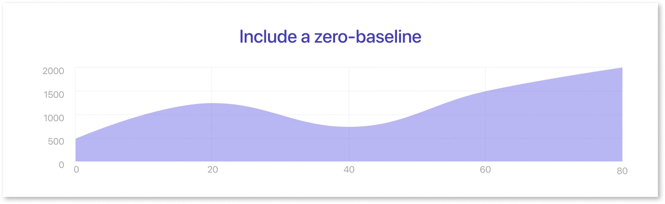
1. Include a zero-baseline
A line chart doesn't have to have a zero baseline, but when shading is added, the heights of the colored areas will be used to compare the sizes of the numbers in each group. So, just like with a bar chart, there has to be a zero standard against which the shading is done. If you cut the axis, the ratio of group numbers would not match what the plot suggests.
2. Limit the number of series in an overlapping area chart
The more series there are in a chart, the more ways to combine colors when they meet. Most colors won't be linked to a single group, making it hard to figure out what they mean. Even with only three series, this can be hard to keep track of. There are seven colors in total: three colors for each series, three colors where two series overlap, and one color where all three series overlap.
3. Consider order of lines in stacked area chart
Even though the form of the plot will be the same no matter what order the lines are drawn in, a good choice of line order can make it easier to understand the data visualization. A good rule of thumb is to put the groups that change the least at the bottom and the groups that change the most at the top. As we'll talk about in the next section, it's hard to read values for every group except the last one, so it's best to make that one the most significant.
With Mokkup.ai, you can easily add and customize a line chart element or an area chart element in your wireframe. Need a different type of chart or diagram? Mokkup.ai has you covered, too. We have an extensive library of pre-built chart elements with endless design options and customization abilities.
Who’s the winner?
We’ll call the area chart vs line chart a draw: both the line chart and the area chart have similar strengths. They can transform boring data into professional and easy-to-read charts in your presentation. Generally, organizations use line graphs because they want to track changes over a small period of time or because they are tracking what the values were at any given point. Area charts can represent longer periods of time and larger differences. While they are used less due to specific constraints, they have a lot of utility. Hence, when to use depends on what the datasets look like and what the ultimate objective is behind creating the graph.
Frequently Asked Questions
A line chart shows data trends over time using a simple line, while an area chart fills the space under the line with color to emphasize volume or magnitude.
Use an area chart when you want to highlight cumulative values, show part-to-whole relationships, or emphasize the scale of change, not just the trend.
Yes, but limit the number of series and use transparency or stacked areas to keep the chart readable and avoid overlap.
Yes, area charts require a zero-baseline because the filled area represents magnitude. Without it, the visual can be misleading.
Choose based on your goal: line charts for trends, bar charts for comparisons, pie or donut charts for proportions, and area charts for showing volume over time.
The four common chart types are line charts, bar/column charts, pie charts, and area charts, though many variations exist depending on data needs.
Prompt it. Wireframe it with Mokkup.ai.
