BI analysts and project managers are responsible for building analytics dashboards that assist their stakeholders in making crucial business decisions. Design is often overlooked when creating dashboards. If reports are not designed to meet the needs and expectations of stakeholders, they may be considered irrelevant or lacking in important information. This can lead to frustration and dissatisfaction among stakeholders, who may feel that their concerns or interests are not being adequately addressed.
Before analysts start working on a BI dashboard, dashboard mockups can help ensure everyone is on the same page. Take a look at a few of the AI tools for data visualization that you can use to create dynamic and insightful dashboards.
What We Will Cover
- What is Dashboard Wireframing?
- Best Tools to Create Dashboard Mockup
- Introduction to Mokkup.ai
- What is Mokkup.ai?
- Why use Mokkup.ai?
- Features of Mokkup.ai
- How to use Mokkup.ai?
- Dashboard Mockup Examples
What is Dashboard Wireframing?
Let’s start with the obvious question: What is a wireframe?
Unlike architectural blueprints, wireframes are two-dimensional floor plans of your web-based apps or websites. They provide a clear overview of page structure, layout, information architecture, user flow, functionality, and intended behavior. Because wireframes represent the original product concept, styles, colors, and graphics are minimal.
A wireframe is a basic mockup of a website, page, dashboard, or app that shows how all the elements will be arranged on the screen. Low-fidelity wireframes are the simplest type. They typically contain general text and items such as images, headings, menus, and button placeholders. Many users now prefer using a dashboard design mockup tool or a free mockup dashboard platform to streamline this stage.
Best Tools to Create a Dashboard Mockup
A high-fidelity mockup is a replica of the UI intended for the final product. These wireframe tools are crucial for UI designers and developers to communicate their ideas and gather stakeholder feedback.
High-fidelity mockups are lifelike and offer stakeholders a better understanding of the final product. They are also more adaptable and allow for more straightforward iteration, thus streamlining the design process.
Designers and developers should strive for high fidelity from the outset. This will help them avoid potential problems in the future. It will also make users more likely to appreciate the product.
If you need to create a high-fidelity mockup of a dashboard, consider using this dashboard mockup online free tool. It will help you precisely replicate the dashboard's appearance and feel.
Here are some of the best dashboard UI examples that you should know:
1) Infogram
Infogram is an online platform that allows users to create and share visual content such as charts, graphs, maps, and infographics. It provides users with a drag-and-drop user interface similar to Adobe XD and a library of customizable templates, icons, and images to create their own data visualizations.
Infogram is used by businesses, media organizations, and individuals to communicate complex information clearly and engagingly. It also allows users to collaborate on projects and track the performance of their visualizations. Infogram is a popular dashboard mockup tool that is free for data journalism, marketing campaigns, and educational content.
2) PowerMockup
PowerMockup is software for making wireframes and mockups for websites, software applications, and other digital products. It is a Microsoft PowerPoint add-in that offers a collection of pre-made shapes and an admin dashboard template free, and can be used to quickly create wireframes mockups without the need for specialized design knowledge. It’s often considered a reliable power mockup tool for beginners.
3) Whatagraph
Whatagraph is an online tool for creating visual reports and analytics from various data sources. Users can choose from multiple report templates and customize them to fit their needs. The platform offers a range of visualization options, including charts, graphs, tables, and timelines, making it easy to communicate complex data in, engaging and easy-to-understand way.
4) Figma
Figma is a dashboard wireframe tool that is free for individual users and has the essential features of design tools. It enables saving and simply dragging and dropping files and components onto the canvas. Users can also save color schemes to ensure the dashboard mockups conform to brand guidelines.
5) Sketch
Many product designers use Sketch, a macOS application created for high-fidelity design. The tool has a robust functionality suite, including pixel-level accuracy, and is comparable to Figma.
In addition to the previously mentioned tools for creating dashboard mockups, a specialized device simplifies the process of constructing a sales dashboard. Let's delve further into this tool and its capabilities to understand it better.
Introduction to Mokkup.ai
In today's world, where everyone is looking at data, making dashboards more efficient is key for businesses to grow. One way to do this is through the use of AI mockups or dashboard mockups. Mockups are a way of visualizing a product or service before it is created. Businesses can use these wireframes to visualize their final data and see how it will function. This helps them make informed decisions before investing time and money into the final product.
A Mockup AI platform is a tool that helps businesses create high-quality, professional-looking mockup dashboard designs quickly and easily. In this blog, we'll introduce Mokkup.ai and show you how it can benefit your business.
What is Mokkup.ai?
Mokkup.ai is an easy-to-use dashboard wireframing tool that allows businesses to quickly and easily create professional-looking mockups. Its user-friendly interface, admin panel, and dashboard template make it accessible to users without design experience. Whether you're an entrepreneur, a small business owner, or the CEO of a large corporation, Mokkup.ai can help you streamline your workflow and improve your products or services.
The platform offers a wide range of free mockup dashboard templates, design elements, and customization options, enabling businesses to create AI mockups that look professional and polished. In addition, Mokkup.ai is constantly updated with new models and features, ensuring your mockups are always up to date with the latest design trends.
Why use Mokkup.ai?
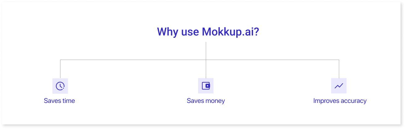
There are several reasons why you want to use Mokkup for your business. Here are a few of the most significant:
- Saves time: Building a dashboard wireframe from scratch can take a lot of time, especially if you are unfamiliar with dashboard design examples. Using Mokkup, you can quickly and easily create a dashboard mockup with a professional appearance, saving you time and effort. You can also browse through pre-built templates, which save more time.
- Saves money: Creating a dashboard mockup with the help of a professional designer can often come with a hefty price tag. But with Mokkup, you can achieve high-quality results without breaking the bank. Mokkup empowers you to create stunning dashboard wireframes without a designer's assistance. Furthermore, with their incredible monthly subscription offer at the price of a single fancy latte, you can enjoy unrestricted access to all of Mokkup's features without worrying about the cost.
- Improves accuracy: With Mokkup, you can create accurate and realistic examples of dashboard wireframing, giving you a better idea of your final product. It can help you identify issues or problems before investing time and money to create the final product.

Features of Mokkup.ai
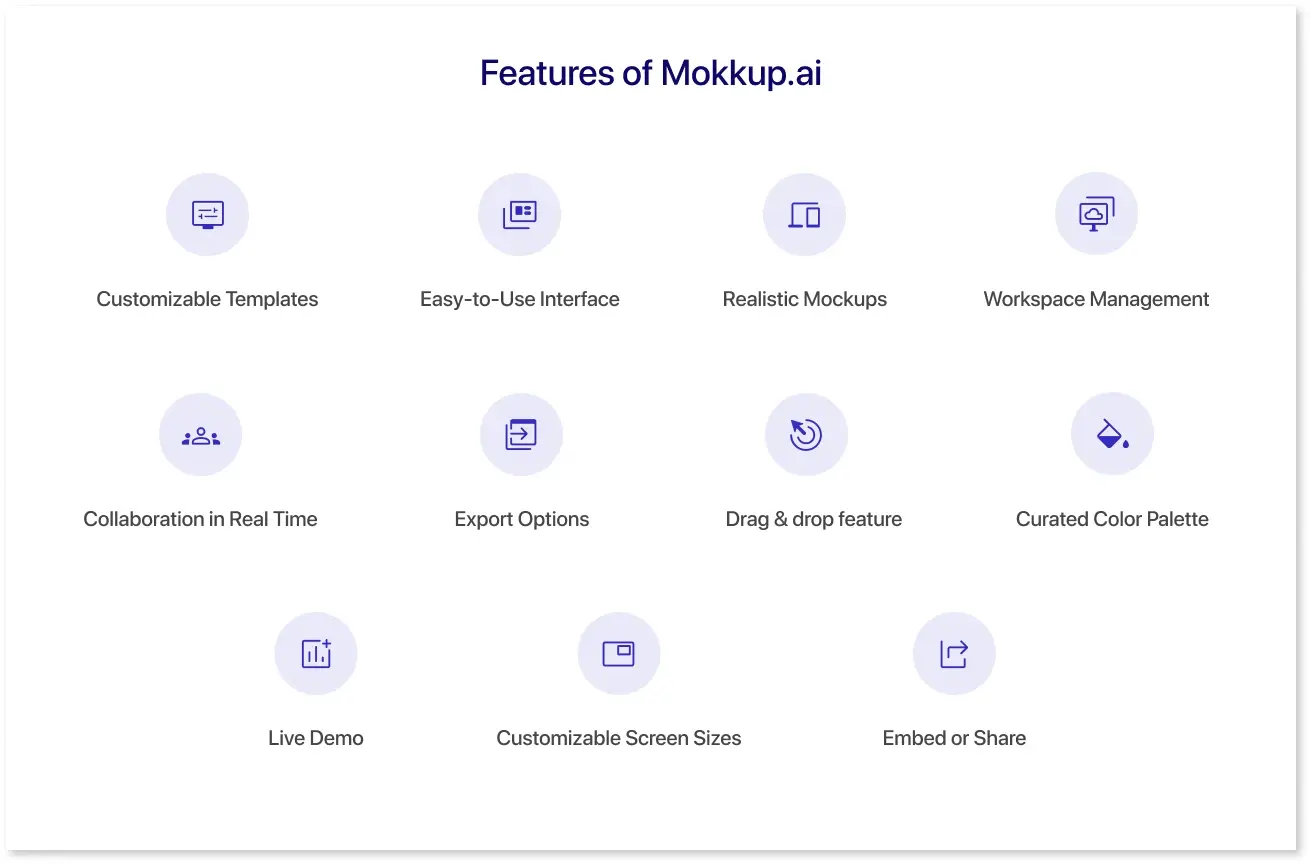
Mokkup.ai has features that make it an ideal tool for businesses of all sizes. Here are a few of the most significant features:
1) Customizable Templates: Mokkup.ai offers a wide range of pre-made templates across eight different categories that are listed below:
- Marketing
- Sales
- Finance
- Operations
- Customer Insights
- HR
- Logistics
- Other
Admin templates under these categories can be customized to fit your needs, including adding text, icons, and other design elements.
2) Easy-to-Use Interface: Mokkup.ai is designed to be user-friendly and easy to use. The platform offers drag-and-drop functionality, making adding elements to your dashboard wireframe easy.
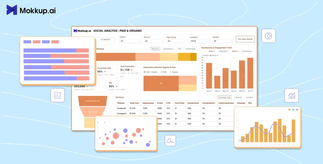
3) Realistic Mockups: With Mokkup.ai, you can create accurate and realistic mockups, giving you a better idea of your dashboard in BI tools like Power BI and Tableau. This can help you identify issues or problems before investing time and money to create the final product. For instance, their social media dashboards are used for identifying the loopholes of the campaigns being launched.
4) Workspace Management: Organize projects, assign roles, and manage who can view, edit, or collaborate across teams. Perfect for agencies and product teams.
5) Collaboration in Real Time: Share dashboards with teammates, leave comments, and review iterations together—without leaving the platform. (Coming Soon)
6) Export Options: Download high-quality PNG, JPG, or PDF mockups—or export in BI-friendly formats for Power BI and Tableau.
7) Drag & drop feature: The drag-and-drop feature of Mokkup.ai allows users to quickly and easily add design elements such as icons, shapes, images, and text boxes. You can select the element you want to add to your design by clicking on it in the sidebar.
8) Curated Color Palette: By choosing an organized color palette, you can ensure that your design has a harmonious palette that creates the desired effect on the viewer. Mokkup.ai offers pre-built themes and color schemes that follow design principles. You can experiment with different color palettes until you find the perfect one for your dashboard.
9) Live Demo: Using Mokkup.ai's live preview feature, you can see how your dashboard template will look in a BI tool, including filter & chart interaction. This can help you visualize the template & the customizations that you need.
10) Customizable Screen Sizes: You can design your interactive prototypes for various devices. Choose from multiple screen sizes for tablets, desktops, and other mobile devices.
11) Embed or Share: Use embed links to integrate dashboards into websites or tools. Or just share a direct link with stakeholders.
How to use Mokkup.ai?
Whether you’re building a dashboard from scratch or customizing a template, Mokkup helps you bring structure and clarity to your design process. Here's a step-by-step breakdown of how to use Mokkup for fast and functional dashboard wireframing:
Step 1: Choose How You Want to Begin
You have two options to kick off your project:
-
Start from Scratch
Pick a canvas size—desktop or tablet. This gives you a blank workspace where you can fully customize every section of your dashboard. -
Pick a Prebuilt Template
Save time with Mokkup’s professionally designed templates across 8 categories like Marketing, HR, Finance, and Customer Insights. These templates include commonly used layout components such as KPI blocks, filters, tables, and charts, so you don’t need to build everything from zero.
Step 2: Add Elements with Drag-and-Drop Simplicity
Use the sidebar to browse and add elements like:
- Headers & text blocks
- Charts (placeholders for bar, line, pie, etc.)
- Icons, images, and shapes
- Navigation panels, filter sections, and buttons
Just drag and drop them into your layout. The built-in alignment guides help you keep everything spaced and structured cleanly—no need for pixel-perfect manual adjustments.
Step 3: Customize the Design to Match Your Use Case
You’re not locked into fixed layouts. Mokkup allows you to:
- Resize or rearrange any element
- Edit chart labels, titles, and placeholder values
- Change color themes or apply prebuilt palettes
- Add branded icons or logos
- Switch between light and dark themes
- Save your favorite components for future use
You can also build multiple screens to showcase variations of the dashboard for different stakeholders or user roles.
Step 4: Share and Collaborate in Real Time (Coming Soon)
Once your dashboard wireframe is ready:
- Invite teammates to view or edit
- Leave comments directly on elements for quick feedback
- Use workspace roles and permissions to manage who can access what
- Collaborate in real time—no need for back-and-forth email chains
Mokkup’s collaboration tools make it easy for design, product, and BI teams to stay aligned.
Step 5: Export or Embed the Final Wireframe
When you’re ready to share your design externally, you have multiple export options:
- PNG, JPG, or PDF for static mockups
- BI-friendly exports for Power BI and Tableau teams
- Embed URL or code to display dashboards on internal tools or client portals
- Direct shareable link for quick stakeholder reviews—no login required
This helps bridge the gap between your design vision and final implementation.
Dashboard Mockup Examples
Mokkup gives you access to various ready-to-use dashboard templates across different business functions. Whether you're planning a campaign overview, sales pipeline, or team performance tracker, these templates provide a structured starting point with editable components like charts, filters, KPIs, and tables. Below are the key template categories available in Mokkup, with real use case examples to help you choose the right one for your project.
1. Marketing Dashboards
Best for: Campaign tracking, channel performance, and conversion metrics.
Example:
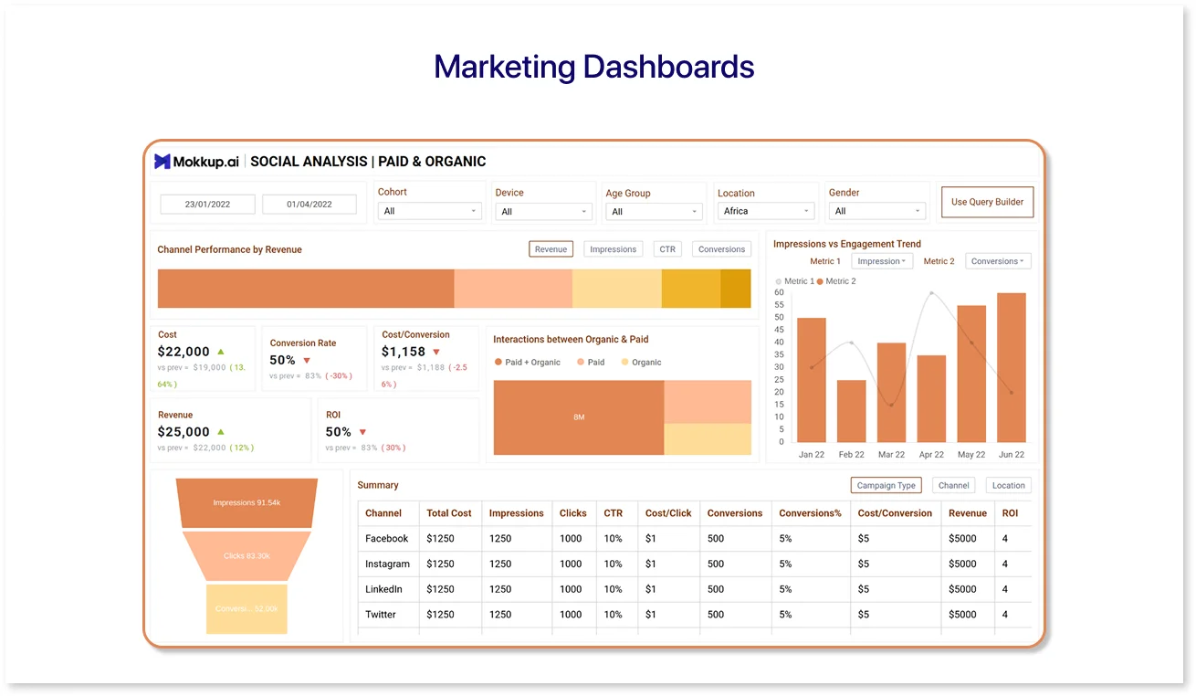
The Social Media Marketing Dashboard template is ideal for teams running multi-channel campaigns. It includes sections for reach, engagement rate, cost per result, and ROI across platforms like Facebook, Instagram, and LinkedIn. This layout helps marketing managers visualize performance at a glance and quickly identify high-performing channels.
If you're designing a campaign-focused layout, this dashboard template is built to save time while keeping reports organized.
2. Sales Dashboards
Best for: Revenue monitoring, sales pipeline tracking, and quota progress.
Example:
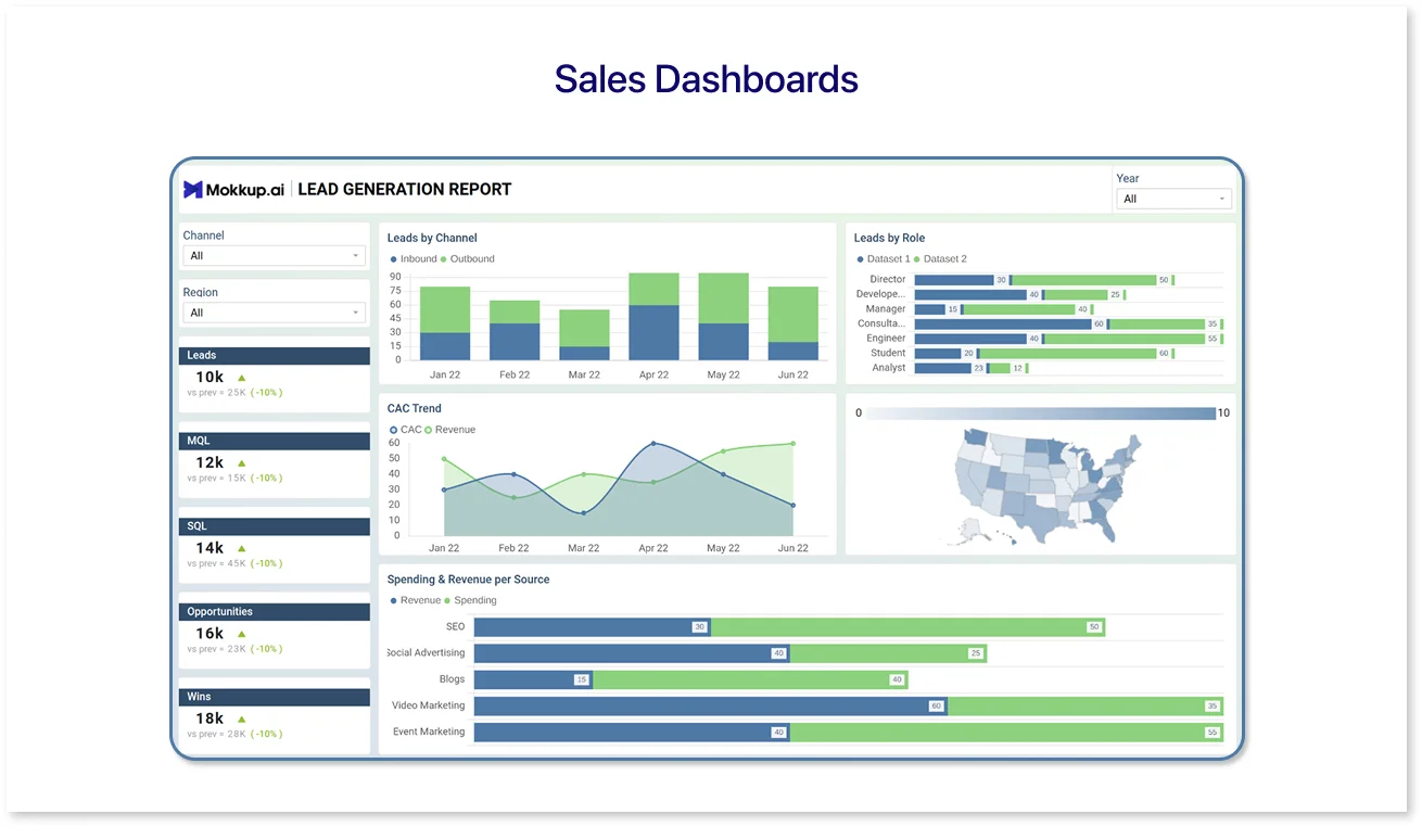
The SaaS lead generation Dashboard template is designed to help sales teams visualize the journey from lead generation to conversion. With drag-and-drop sections for pipeline stages, deal status by rep, and revenue forecast, this template gives you a solid framework to map your sales data and performance metrics.
It's especially helpful if you're wireframing CRM views or preparing dashboards for monthly reviews.
3. Finance Dashboards
Best for: Budget tracking, financial summaries, and cost breakdowns.
Example:
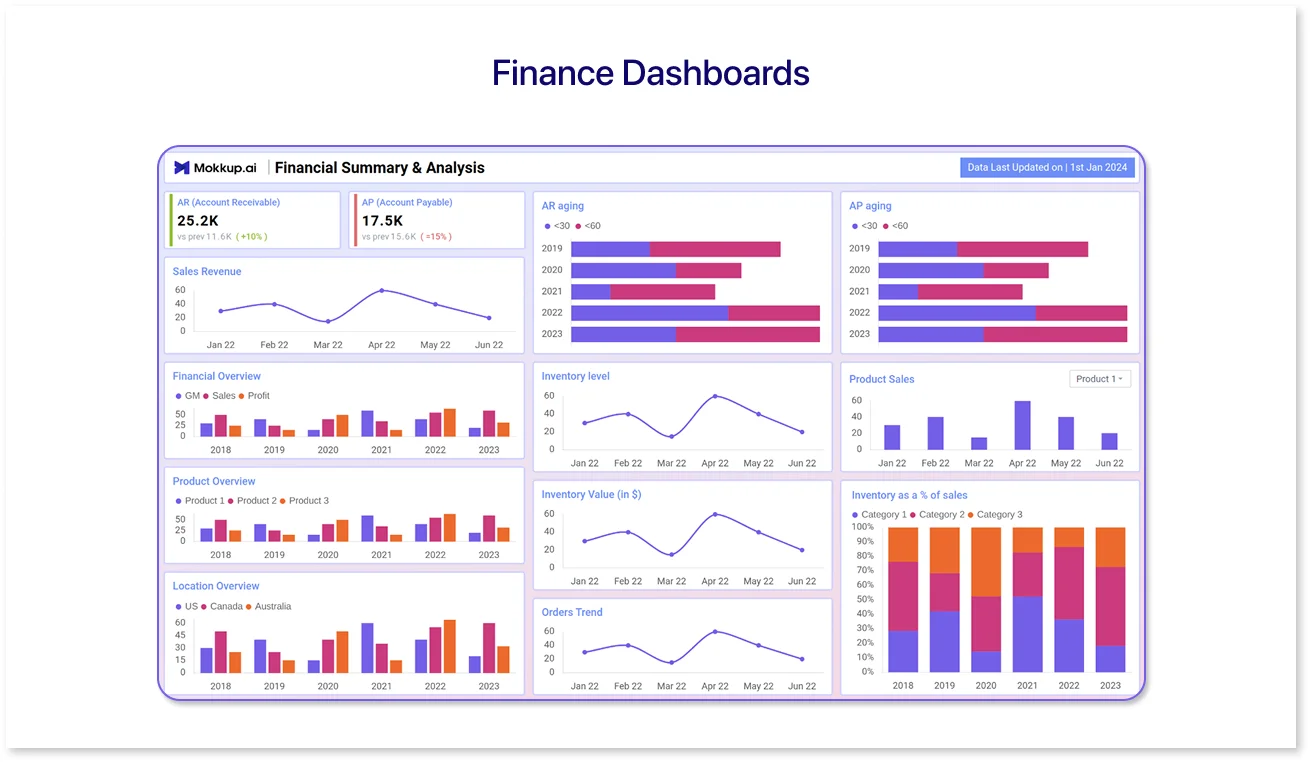
Use the Financial Summary & Analysis to wireframe layouts that include income vs. expense charts, actual vs. forecasted budget views, and department-level breakdowns. This template is perfect for financial teams creating internal reports or BI dashboard outlines for executives.
It brings structure to typically complex financial layouts and helps maintain visual balance while showcasing key metrics.
4. Operations Dashboards
Best for: Monitoring internal workflows, SLAs, and daily processes.
Example:
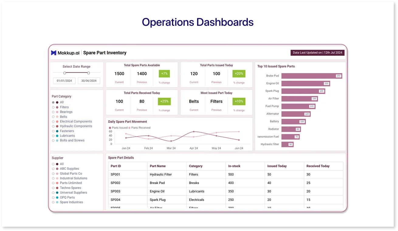
The Inventory Management Dashboard template is built to track operational efficiency. It features design placeholders for inventory levels, stock alerts, order fulfillment rates, and shipping delays. Whether you’re managing retail logistics or warehouse performance, this template helps simplify backend data into a clean layout.
You can also adapt this for supply chain dashboards with minor tweaks.
5. Customer Insights Dashboards
Best for: Customer behavior, support metrics, and satisfaction scores.
Example:
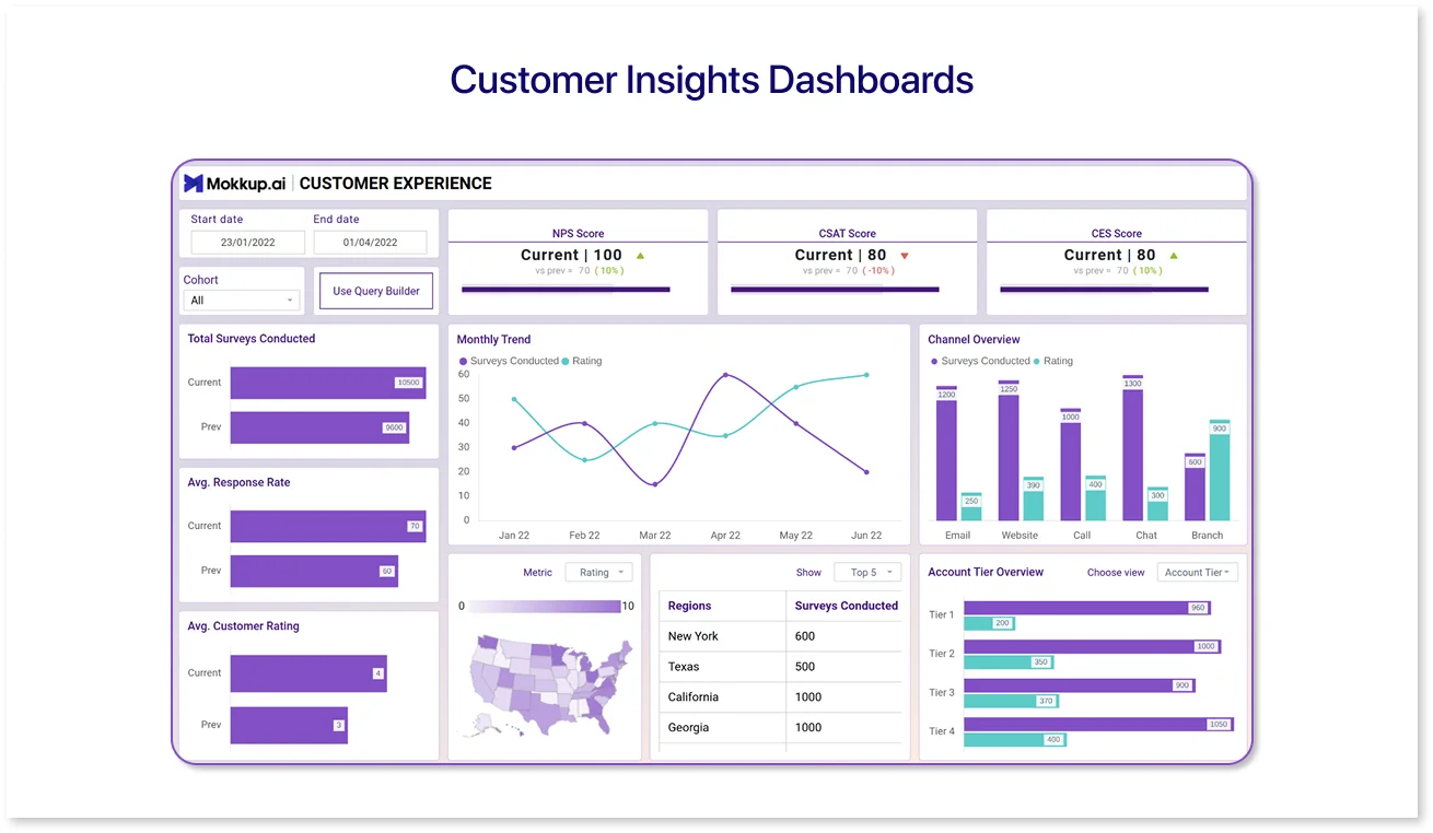
With the Customer Experience Dashboard, you can plan screens highlighting NPS scores, CSAT trends, churn predictions, and customer segments. It’s a great starting point for teams focused on improving user satisfaction and retention.
This template is suitable for support teams, product managers, and anyone who wants to tell a story through customer data.
6. HR Dashboards
Best for: Employee engagement, hiring metrics, and headcount tracking.
Example:
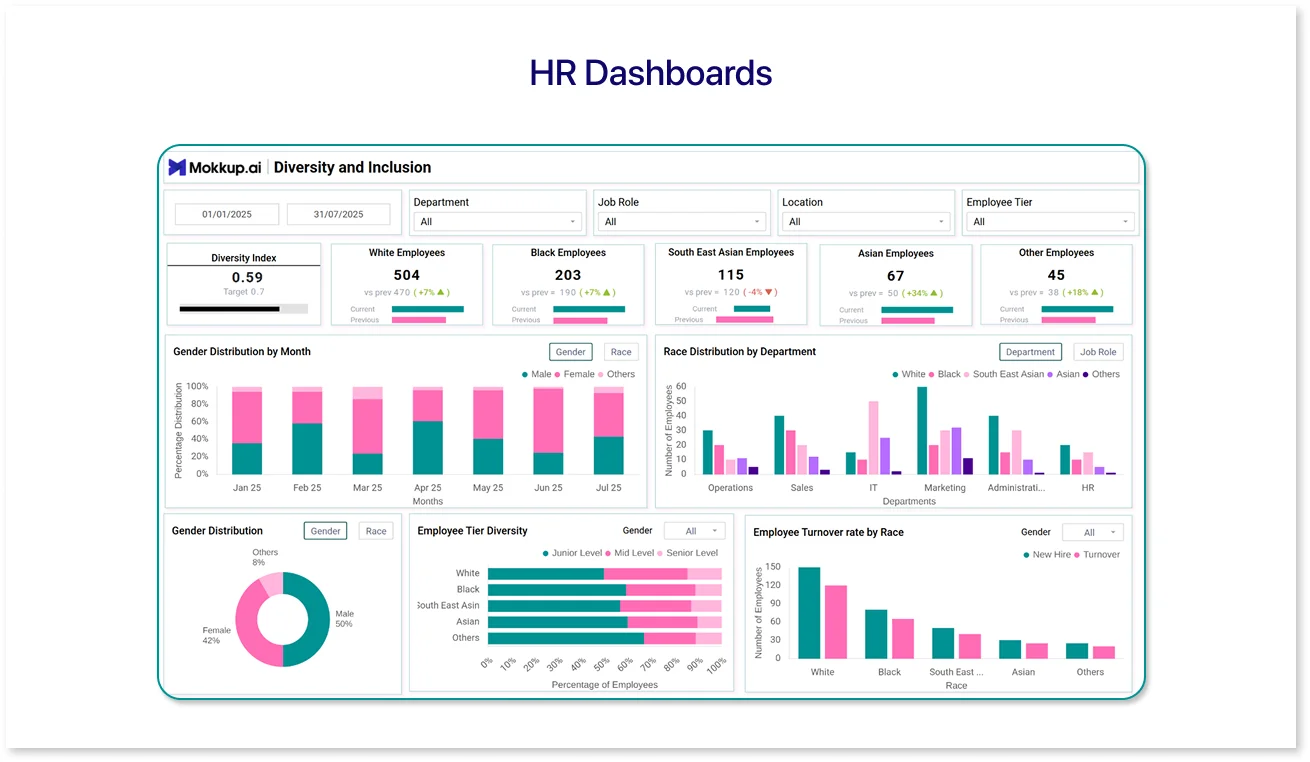
The Organizational Employee Overview Dashboard template offers structured components for workforce size, hiring metrics, attrition rates, and appraisal timelines. HR teams can use this to wireframe dashboards for internal reviews or headcount planning.
It’s especially useful when you need to showcase people's data across departments in a way that’s both visual and functional.
Each template is fully customizable, so whether starting from scratch or adjusting a layout, Mokkup lets you build clear and structured dashboards without design expertise.
Conclusion
Mokkup is a useful prototyping tool for businesses. It helps them streamline their processes and create professional-looking dashboard wireframes quickly and easily. Its user-friendly interface, pre-made templates, and customizable design elements make it accessible to users without prior design experience. With Mokkup.ai, businesses can save time and money, improve collaboration, and create accurate and realistic wireframes of their dashboards. Whether designing it for internal use or external showcase, Mokkup.ai can help you visualize data and communicate your design ideas effectively with your team or clients.

Frequently Asked Questions
A dashboard mockup is a detailed visual layout of your final dashboard, including colors, charts, and text. Unlike a wireframe, which shows a basic structure, a mockup offers a polished preview. Tools like Mokkup.ai help create mockups quickly without design skills.
Mockups help teams visualize how data will appear and function before development begins. They reduce errors, save time, and ensure everyone agrees on the layout. Free tools like Mokkup.ai make it easy to build and share these visuals.
Start by listing your dashboard goals and key metrics. A tool like Mokkup.ai can then be used to drag and drop components into a pre-built or custom layout. You can tweak colors, export designs, and share mockups easily—all without design experience.
Prompt it. Wireframe it with Mokkup.ai.
